
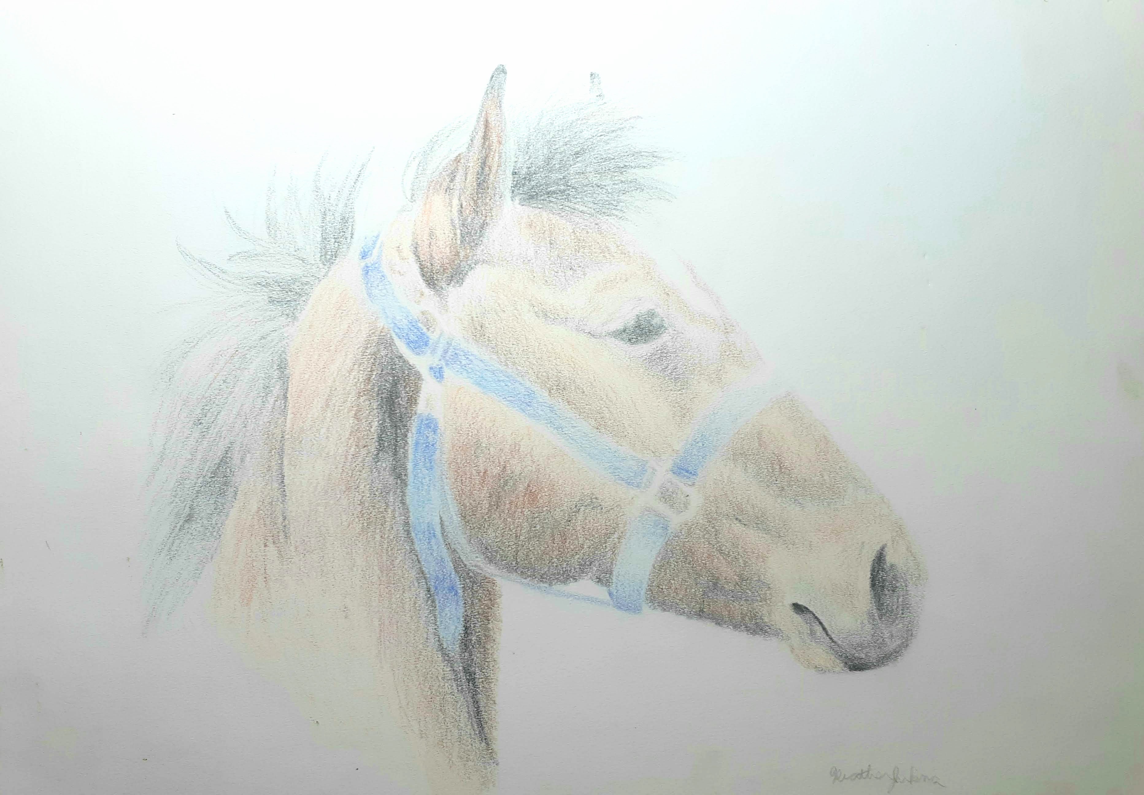
A few tips for coloured pencil drawings:
Layer colours over each other and let the eye blend them together. So, if you are looking for the colour violet, layer red over blue. This actually makes the colours more vibrant.
To get a deeper tone, instead of adding straight black, add a touch of the darker hue on the colour wheel next to the hue you are using. For instance, if you want a deeper tone of blue, instead of adding straight black, add a touch of violet.
Same for a lighter tone. Instead of using white to lighten your tone, use the next colour up on the wheel, so if you are using red, use a touch of orange.
If you want grey a tone out because it’s too vibrant (such as foliage in the background of a picture) add a touch of the complementary colour. So for green, use a touch of red (this is also called smuggling reds).
If you can, mix your own browns and blacks. If you mix red, yellow and blue in uneven amounts, you will get a very natural brown. If you mix these three primary hues in even quantities, you will get a black.
And as my art teacher once said, “pure black should only be used for the pupil of the eye.”
I’m breaking some the rules here, but, it’s okay to break the rules if you know why you are doing it.
As always, have fun!
